Shane's Cards
Redesigning to modern standards
Summary
I redesigned Shane’s website by simplifying the color palette, improving hierarchy, and introducing a cleaner, more intuitive layout. Along with improved layout, I designed product cards to showcase product information and provide customers confidence to go to the store and purchase.
I redesigned Shane’s website by simplifying the color palette, improving hierarchy, and introducing a cleaner, more intuitive layout. Along with improved layout, I designed product cards to showcase product information and provide customers confidence to go to the store and purchase.
I redesigned Shane’s website by simplifying the color palette, improving hierarchy, and introducing a cleaner, more intuitive layout. Along with improved layout, I designed product cards to showcase product information and provide customers confidence to go to the store and purchase.
Role
UX Designer
Tools
Figma
Duration
Nov - Dec 2025
Read Length
8 min
What did I do?
What did I do?
UX Research
User Interviews
Web Design
UX Research
User Interviews
Web Design
Wireframing
Prototyping
Usability Testing
Wireframing
Prototyping
Usability Testing
Overview
Overview
Shane's Cards is a local card shop for anything card or board game related in Renton, Washington. They are known for their wide assortment of products such as Magic and Pokemon cards.
Shane's Cards is a local card shop for anything card or board game related in Renton, Washington. They are known for their wide assortment of products such as Magic and Pokemon cards.
Shane's Cards is a local card shop for anything card or board game related in Renton, Washington. They are known for their wide assortment of products such as Magic and Pokemon cards.
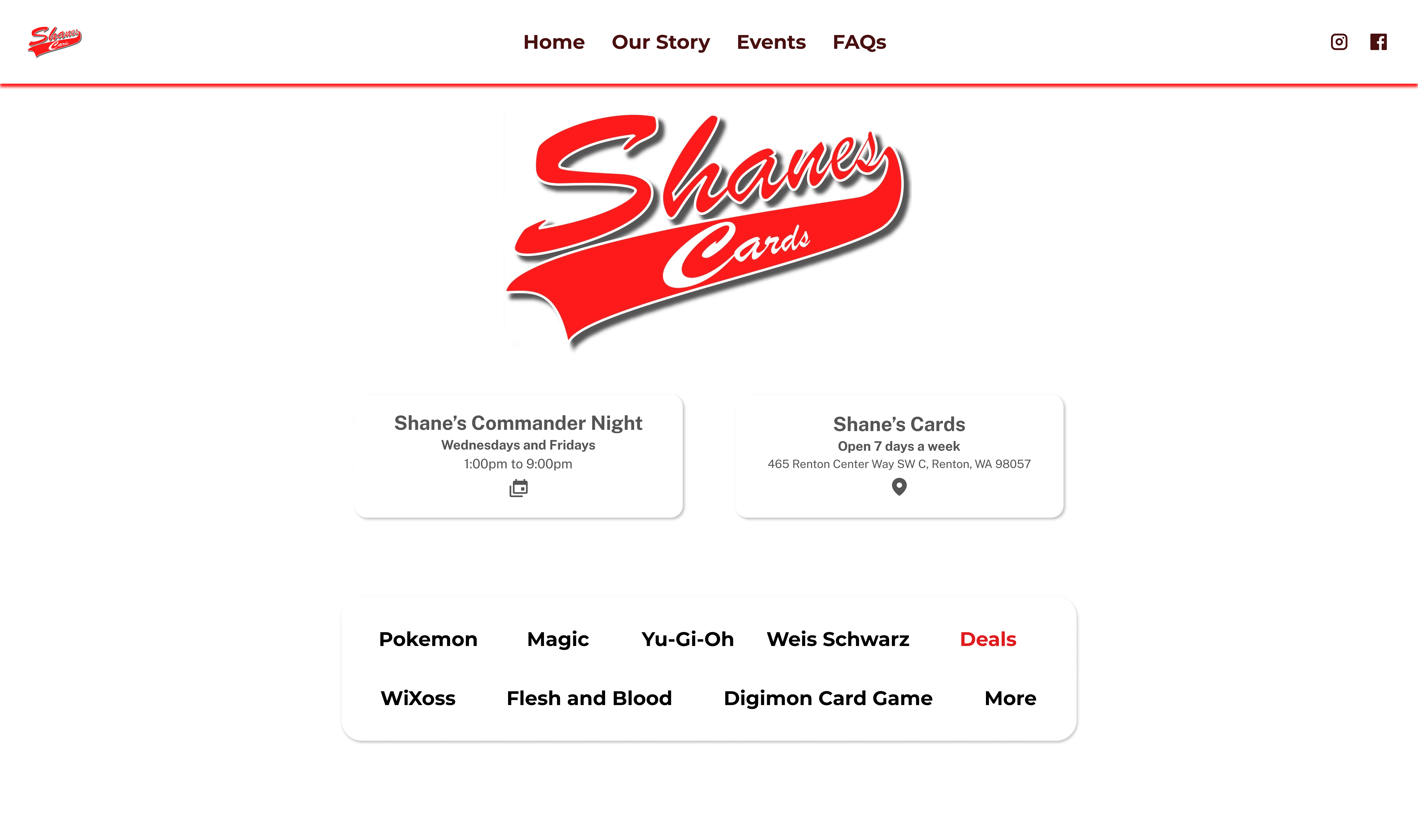
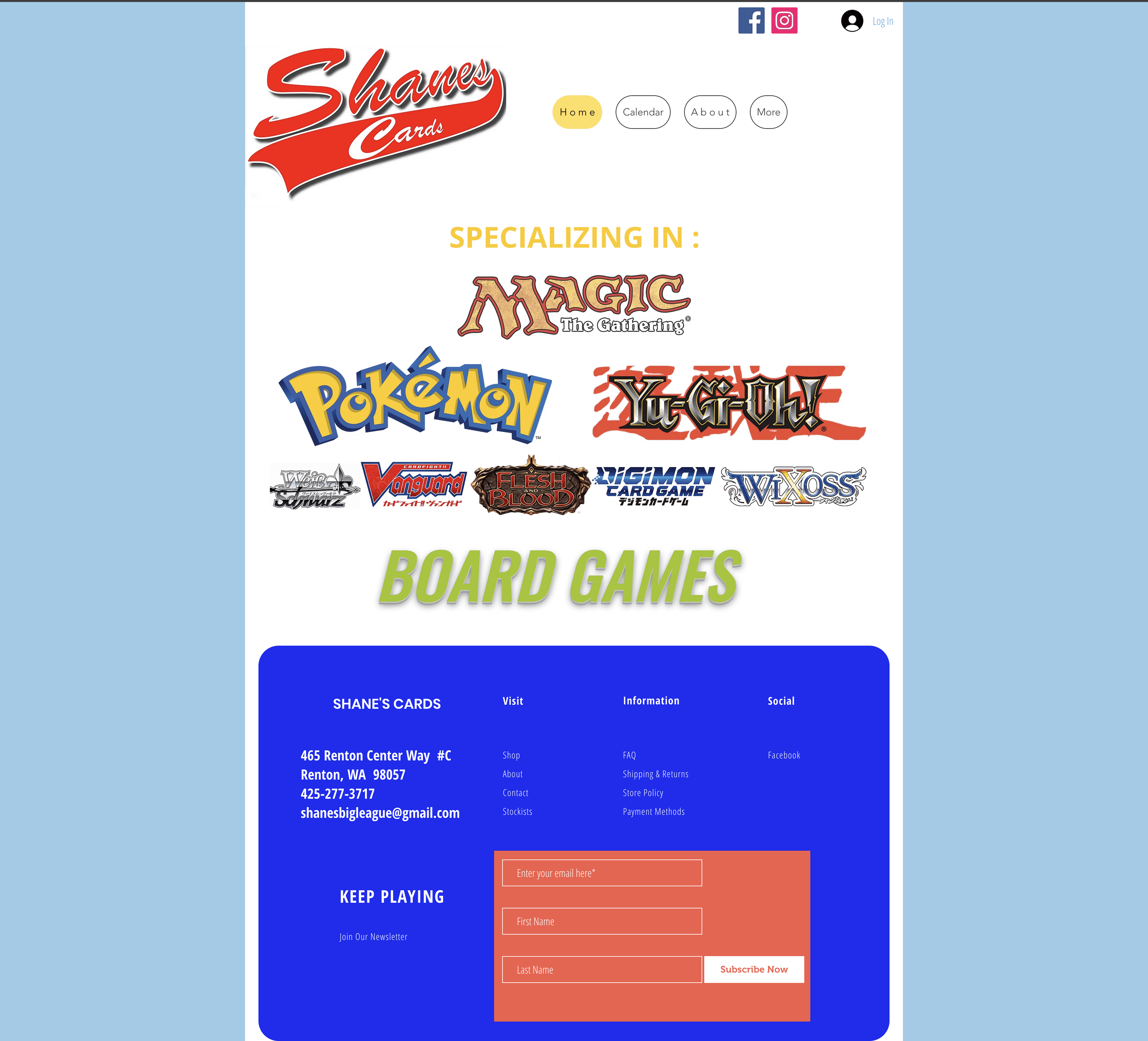
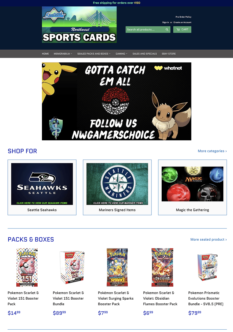
Current Shanes Website
Current Shanes Website
Defining the Problem
"Not sure where to go or find the information I'm looking for."
"Not sure where to go or find the information I'm looking for."
Customers have trouble finding specific products in the website.
Other than the main products, there is no catalog or specific information on detailed products and availability on those products. There is a lack of product discovery which reduces the chance of a purchase.
Customers have trouble finding specific products in the website.
Other than the main products, there is no catalog or specific information on detailed products and availability on those products. There is a lack of product discovery which reduces the chance of a purchase.
Customers have trouble finding specific products in the website.
Other than the main products, there is no catalog or specific information on detailed products and availability on those products. There is a lack of product discovery which reduces the chance of a purchase.
Pain Points
Users can't find specific products
Users can't find specific products
The website only shows generic titles and lacking details.
The website only shows generic titles and lacking details.
Lack of product info creates uncertainty
Lack of product info creates uncertainty
No product descriptions, details, specs, or images means users can’t make informed decisions.
No product descriptions, details, specs, or images means users can’t make informed decisions.
Inconsistent colors causes distractions
Inconsistent colors causes distractions
Too many colors create visual noise and weaken the hierarchy, making it difficult where to focus attention.
Too many colors create visual noise and weaken the hierarchy, making it difficult where to focus attention.
Poor Navigation Slows Down the Shopping Experience
Poor Navigation Slows Down the Shopping Experience
Generic titles with no hierarchy force users to click blindly
Generic titles with no hierarchy force users to click blindly
Objectives and Goals
Transforming Confusion into Clarity for a Seamless Shopping Experience
Transforming Confusion into Clarity for a Seamless Shopping Experience
Goal 1
Help users quickly find what they are looking for.
Help users quickly find what they are looking for.

Goal 2
Give users the information they need to feel confident and informed when choosing a product.
Give users the information they need to feel confident and informed when choosing a product.

Goal 3
Create a clean, modern visual system that improves readability and guides user attention.
Create a clean, modern visual system that improves readability and guides user attention.

Research and Insights
Finding the Sweet Spot Between User Needs and Business Goals
Finding the Sweet Spot Between User Needs and Business Goals
Interviews
I interviewed employees and customers to understand the space and learn the perspectives of what information customers are looking for and what the business needs out of the website.
I interviewed employees and customers to understand the space and learn the perspectives of what information customers are looking for and what the business needs out of the website.
I interviewed employees and customers to understand the space and learn the perspectives of what information customers are looking for and what the business needs out of the website.
Push back
"Cards and Product prices shift like the stock market."
"Cards and Product prices shift like the stock market."
I suggested adding a product catalog. It raised push back as they had tried to implement one in the past and that it was difficult to maintain.
I suggested adding a product catalog. It raised push back as they had tried to implement one in the past and that it was difficult to maintain.
I suggested adding a product catalog. It raised push back as they had tried to implement one in the past and that it was difficult to maintain.
What they tried
What they tried
Manually update prices
Manually update prices
Third-party app price updater
Third-party app price updater
Why it didn't work
Why it didn't work
Time-consuming and inefficient as card prices change every day
Time-consuming and inefficient as card prices change every day
Became too expensive to keep
Became too expensive to keep
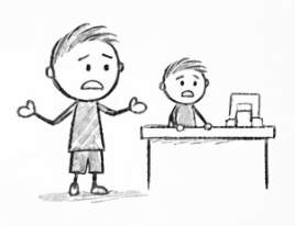
Advocating for the user
I shared a story with the owner …
I shared a story with the owner …
This was to give them an idea of what customers go through and help them empathize what users go through when using their current website. This helped with easing in the suggestion of a good product catalog which could help avoid future customer frustrations.
This was to give them an idea of what customers go through and help them empathize what users go through when using their current website. This helped with easing in the suggestion of a good product catalog which could help avoid future customer frustrations.
This was to give them an idea of what customers go through and help them empathize what users go through when using their current website. This helped with easing in the suggestion of a good product catalog which could help avoid future customer frustrations.
Exploring
Exploring
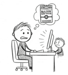
Jordan tried to buy a Black & White Pokémon booster bundle online for his son who's been asking for almost 3 months.
Jordan tried to buy a Black & White Pokémon booster bundle online for his son who's been asking for almost 3 months.
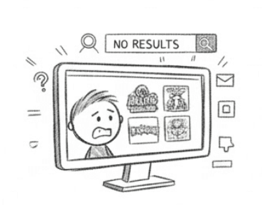
Lost
Lost
He checks the website which only showed brands such as Magic, One Piece, and Pokémon but they didn't provide information on which bundles.
He checks the website which only showed brands such as Magic, One Piece, and Pokémon but they didn't provide information on which bundles.
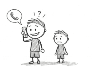
Calling
After navigating vague categories and finding nothing, Jordan called and learned the cards were in stock at a nearby store.
After navigating vague categories and finding nothing, Jordan called and learned the cards were in stock at a nearby store.
Hopeful
With newfound hope they drove across town excited to buy the long awaited cards.
With newfound hope they drove across town excited to buy the long awaited cards.
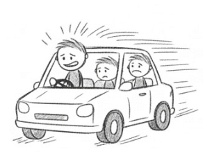
Frustrated
That hope quickly faded when they arrived to find the store had none, leaving Jordan frustrated and his son disappointed.
That hope quickly faded when they arrived to find the store had none, leaving Jordan frustrated and his son disappointed.
Respecting business constraints with user needs
Collaboration and compromise
Collaboration and compromise
The primary reason for avoiding a product catalog was maintaining up-to-date pricing. Continuously updating prices or paying for automated pricing services would add unnecessary cost and operational effort.
To strike a balance, I proposed removing price tags from the potential product catalog. Instead, the site would emphasize product details such as available card sets or expansions and the condition the product to spark interest and curiosity. This encourages customers to call or visit the store, increasing foot traffic and the likelihood of in-store purchases.
Ideation and Concepts
"Definitely in need of a visual facelift."
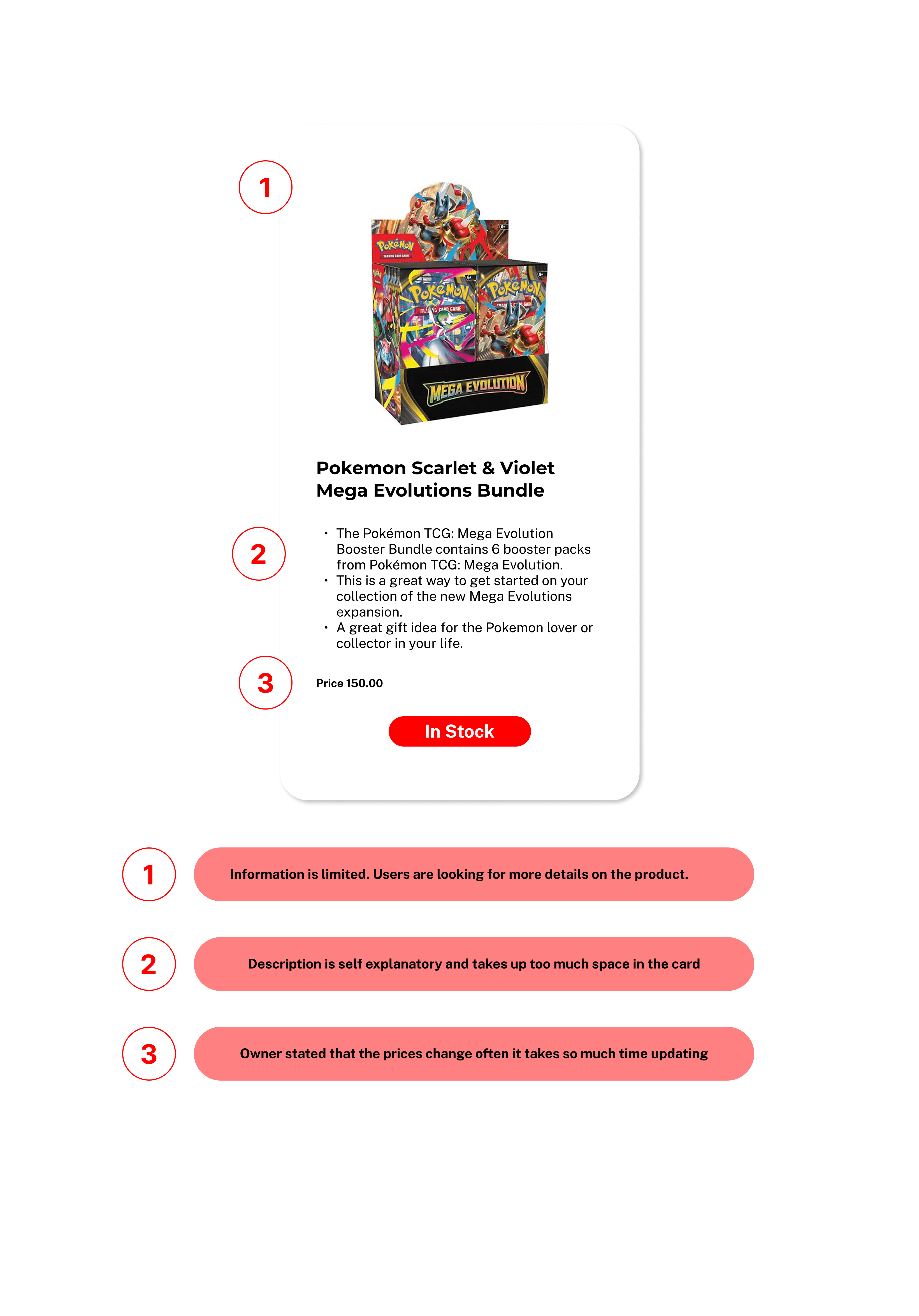
I did a visual heuristic evaluation of the current website to help lay out a plan of what the new design of the website would like and pointed out the following that needed improvements
I did a visual heuristic evaluation of the current website to help lay out a plan of what the new design of the website would like and pointed out the following that needed improvements
I did a visual heuristic evaluation of the current website to help lay out a plan of what the new design of the website would like and pointed out the following that needed improvements
Heuristic Evaluation
Heuristic Evaluation
Visual
Hierarchy
Layout
&
Structure
Color
Principles
Improve
Consistency
Spacing
Branding
placement
User Focus
Competitive Analysis
Competitive Analysis
I pulled inspiration through viewing numerous card websites. I focused on three that provided better visual hiechary which I adopted and adapted into my design solutions.
I pulled inspiration through viewing numerous card websites. I focused on three that provided better visual hiechary which I adopted and adapted into my design solutions.
I pulled inspiration through viewing numerous card websites. I focused on three that provided better visual hiechary which I adopted and adapted into my design solutions.
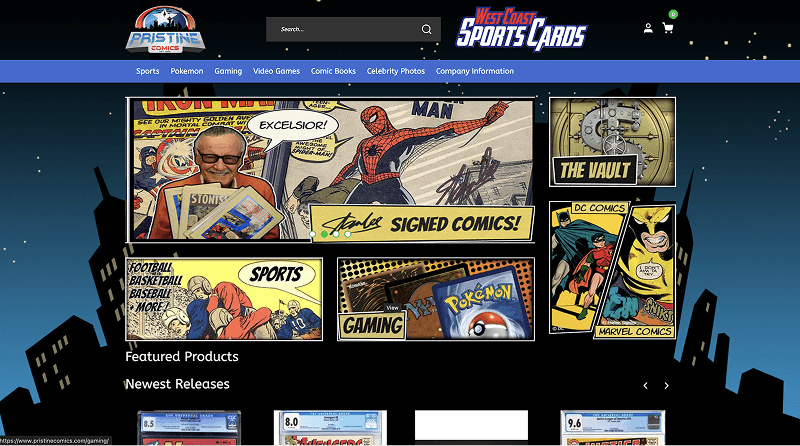
West Coast Sports Cards
Pros
Strong Visual Hierarchy
Strong Visual Hierarchy
Product cards that show product details
Product cards that show product details
Cons
Hero ad takes a large part of the site.
Hero ad takes a large part of the site.
Numerous colors to take in
Numerous colors to take in
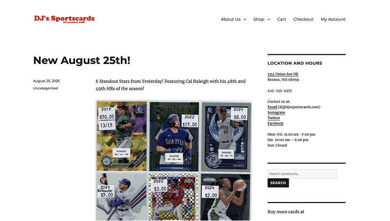
DJ's Sports Cards
Pros
Minimal Navbar
Minimal Navbar
Easy to view
Easy to view
Cons
Needs improvement in spacing and alignment
Needs improvement in spacing and alignment
Northwest Sports Cards
Pros
Strong layout
Strong layout
Product cards that show product details
Product cards that show product details
Cons
Hero ad takes a large part of the site
Hero ad takes a large part of the site
Solutions
3 key points to solve
Work within the business goals
Enable technicians to view only the most relevant, actionable information at a glance.
Enable technicians to view only the most relevant, actionable information at a glance.
Enable technicians to view only the most relevant, actionable information at a glance.
Using Users’ Language
Clearly presenting all available product options to users so they can make informed choices with their purchases.
Clearly presenting all available product options to users so they can make informed choices with their purchases.
Clearly presenting all available product options to users so they can make informed choices with their purchases.
Familiar intuitive consistency
Creating social proof by showing customer reviews and ratings on products to build trust and support confident purchasing decisions.
Creating social proof by showing customer reviews and ratings on products to build trust and support confident purchasing decisions.
Creating social proof by showing customer reviews and ratings on products to build trust and support confident purchasing decisions.
Usability Testing
MVP
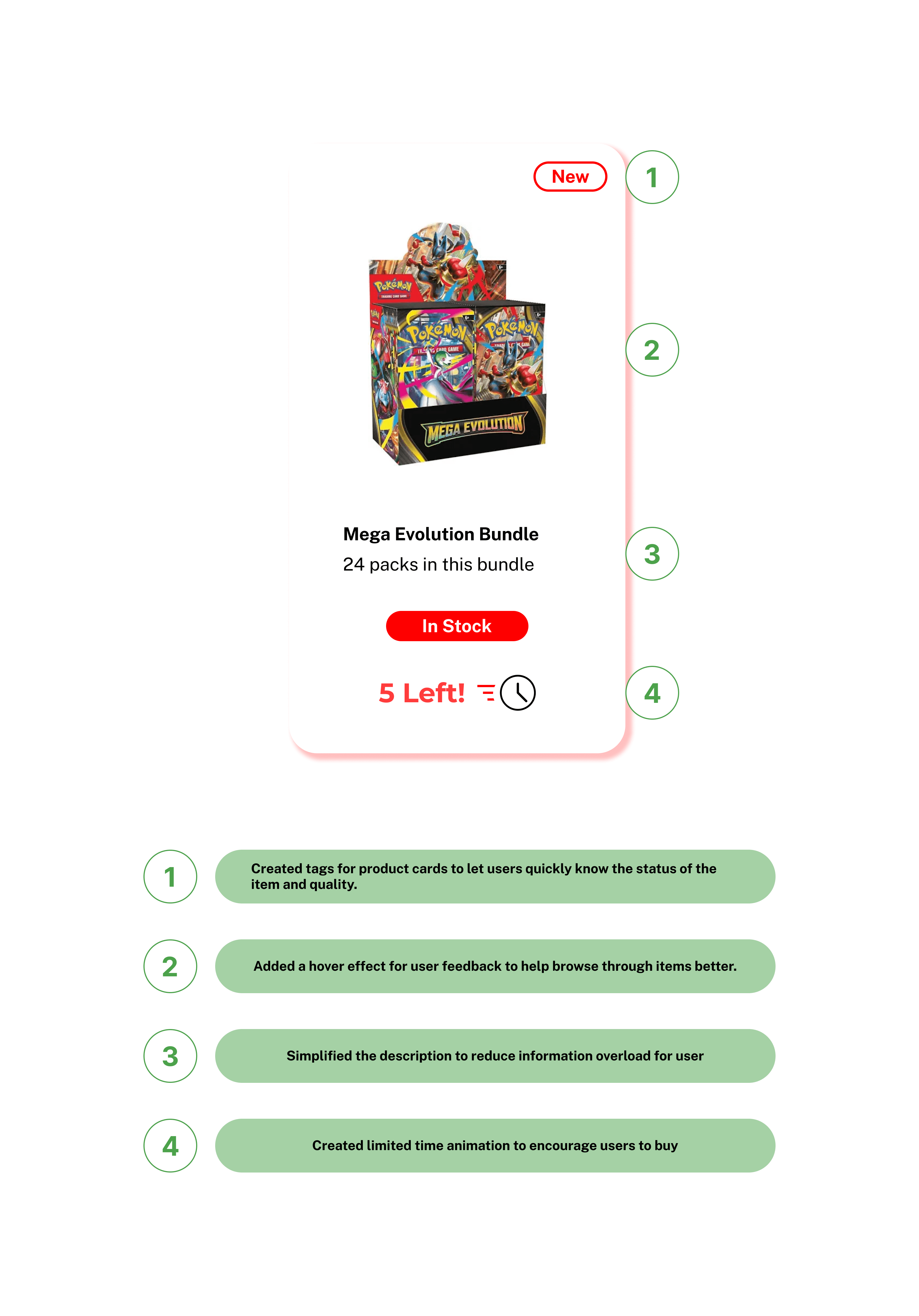
Solution 1
Visual Hierarchy - Familiarity
Visual Hierarchy - Familiarity
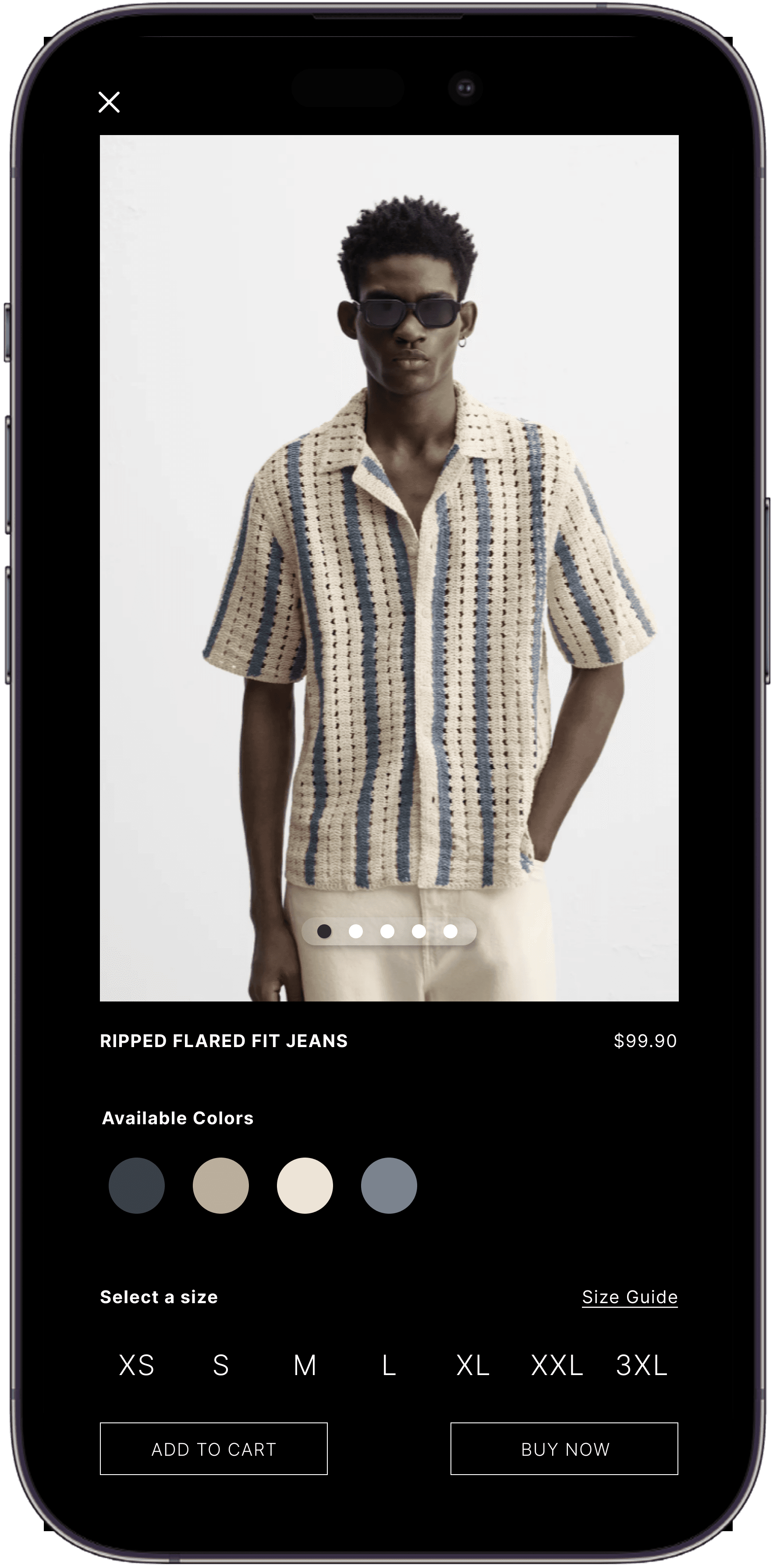
Created a layout that displayed product information in order for users to find the products they were looking for.
Solution 2
Improved navigation
Improved navigation
Implemented bread crumbs, horizontal scrolling between products within categories.
Solution 3
Information that matters
Information that matters
Designed the product page that displays all the information the customer needs and created call to action buttons to assist user further to purchase products at the store.

Challenges
Implementing the solution in real time.
Due to budget constraints the owner opted not to adopt the designs that I had although there were metrics to validate that my design solution would increase foot traffic and provide return on investment.
Due to budget constraints the owner opted not to adopt the designs that I had although there were metrics to validate that my design solution would increase foot traffic and provide return on investment.
Impact
Efficiency, clarity, and ease of decision-making
Efficiency, clarity, and ease of decision-making
I measured my solution with users to get some metrics. Below are the metrics I tested with users with my solution.
I measured my solution with users to get some metrics. Below are the metrics I tested with users with my solution.
Task Success Rate

90%
Users were able to complete task successfuly.
Task Success Rate
90%
Users were able to complete task successfuly.
Click path efficiency

5 clicks
Customers were able to find products within 5 clicks
Click path efficiency
5 clicks
Customers were able to find products within 5 clicks
Customer Error rate

10%
Customers had only 10% errors.
Customer Error rate
10%
Customers had only 10% errors.
Reflection
What did I learn?
What did I learn?
There's only so much designers can do even with sufficient statistics and metrics when defending design solutions sometimes projects fall through and it is out of our hands at that point.
I left the door open in that if they ever do decide to continue that I would be more than happy to help and assist the design solution that I presented.
Future plans
Future plans
As a designer I always want to learn, grown and improve my work. I do plan to come back to this project, do usability tests to improve the navigation flow to work on the information architecture and create more micro interactions in the site.