ZARA
Helping customers buy with confidence
Helping customers buy with confidence
Summary
I designed a mobile solution to improve the product view page by making it easier for customers to view available product colors, sizes and product reviews to build confidence to purchase a product increasing conversion rates.
I designed a mobile solution to improve the product view page by making it easier for customers to view available product colors, sizes and product reviews to build confidence to purchase a product increasing conversion rates.
Role
UX Designer
UX Designer
Tools
Figma
Figma
Duration
May - July 2025
May - July 2025
Read Length
8 min
8 min
What did I do?
What did I do?
UX Research
UX Research
User Interviews
User Interviews
Mobile Design
Mobile Design
Wireframing
Wireframing
Prototyping
Prototyping
Usability Testing
Usability Testing
Overview
Overview
Zara is one of my favorite brands, but using their app was a frustrating experience.
It was difficult to navigate, and every time I tried to view details about an item, it would switch to a different product.
After losing track of the jacket I liked and finding out it was only available online, I realized how inconvenient the app could be.
That experience inspired me to start this project!
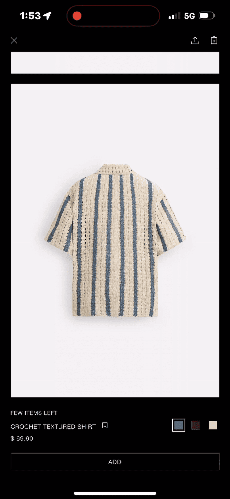
Current Zara App
Defining the Problem
"It's very confusing to navigate through."
The Zara app is difficult to navigate, with a confusing layout and flow that often frustrate users. This poor user experience leads many customers to abandon the app in hopes of getting their products in store, only to further be frustrated when its not there.
The Zara app is difficult to navigate, with a confusing layout and flow that often frustrate users. This poor user experience leads many customers to abandon the app in hopes of getting their products in store, only to further be frustrated when its not there.

"I couldn’t find my size on the app, so I called and then went to the store, only to find out they no longer had it. I was pretty upset."
-Frequent Shopper, Female, 25

"I can't seem to find where to see available sizes?"
-Tech mom, Female, 35

"I'm literally doom scrolling to find the info of what material the clothes are made off. Very confusing."
-Social Media Influencer, Male, 21
Pain points
Swiping left or right changes product
Users swipe left or right expecting to see different photos of the product. But in this instance it changes the product entirely.
Swiping left or right changes product
Users swipe left or right expecting to see different photos of the product. But in this instance it changes the product entirely.
Pain points
Hidden Size Options
Users scroll and are not able to find the size options of the product.
Hidden Size Options
Users scroll and are not able to find the size options of the product.
Endless vertical scrolling
Users scroll through many photos of the product and it takes forever to see information to make a valid purchase
Endless vertical scrolling
Users scroll through many photos of the product and it takes forever to see information to make a valid purchase
Objectives and Goals
Streamline customer paths to product info
Streamline customer paths to product info
There are too many paths a customer goes through when viewing product information. The design solution will create a structured flow for customers to easily access and view information without lost or confused. This will increase chances for product purchases.
There are too many paths a customer goes through when viewing product information. The design solution will create a structured flow for customers to easily access and view information without lost or confused. This will increase chances for product purchases.
Goal 1
Improve Swipe Navigation
Ensure that swiping left or right allows users to view additional photos of the same product, not switch to a different one.
Goal 1
Improve Swipe Navigation
Ensure that swiping left or right allows users to view additional photos of the same product, not switch to a different one.
Goal 2
Enhance Discoverability & Accessibilty
Ensure size options are visible and easy to access without extra scrolling.
Goal 2
Enhance Discoverability & Accessibilty
Ensure size options are visible and easy to access without extra scrolling.
Goal 3
Content Efficiency & Information Prioritization
Present key product details early and reduce unnecessary scrolling.
Goal 3
Content Efficiency & Information Prioritization
Present key product details early and reduce unnecessary scrolling.
Research and Insights
Understanding users
Understanding users
I interviewed 10 customers and wanted to know what their experience was like using the application from what they liked and what they disliked about the app. The point of the interviews was to better understand where the user is coming from when using the app as they are the ones using the application.
I interviewed 10 customers and wanted to know what their experience was like using the application from what they liked and what they disliked about the app. The point of the interviews was to better understand where the user is coming from when using the app as they are the ones using the application.
Findings 1
"I don't see where to select my size?"
Findings 1
"I don't see where to select my size?"
Findings 2
"Lost is an understatement. I can't find information."
Findings 2
"Lost is an understatement. I can't find information."
Findings 3
"Feels like i'm doomscrolling. I'm unsure of the product i'm looking at.
Findings 3
"Feels like i'm doomscrolling. I'm unsure of the product i'm looking at.
Ideation and Concepts
How might we …
How might we …
Design the app’s navigation to be more intuitive and help users find what they need without getting lost?
Design the app’s navigation to be more intuitive and help users find what they need without getting lost?

Make size options more visible and accessible so users can easily find and select the right size?
Make size options more visible and accessible so users can easily find and select the right size?

Provide confidence for users to increase their chance of purchasing a product.
Provide confidence for users to increase their chance of purchasing a product.

Solutions
3 key points to solve
3 key points to solve
Familiarity with scrolling actions
Familiarity with scrolling actions
Users expect to view product photos while horizontally scrolling, as this aligns with familiar scrolling behaviors.
Users expect to view product photos while horizontally scrolling, as this aligns with familiar scrolling behaviors.
Information transparency
Information transparency
Clearly presenting all available product options to users so they can make informed choices with their purchases.
Clearly presenting all available product options to users so they can make informed choices with their purchases.
Social Proof products
Social Proof products
Creating social proof by showing customer reviews and ratings on products to build trust and support confident purchasing decisions.
Creating social proof by showing customer reviews and ratings on products to build trust and support confident purchasing decisions.
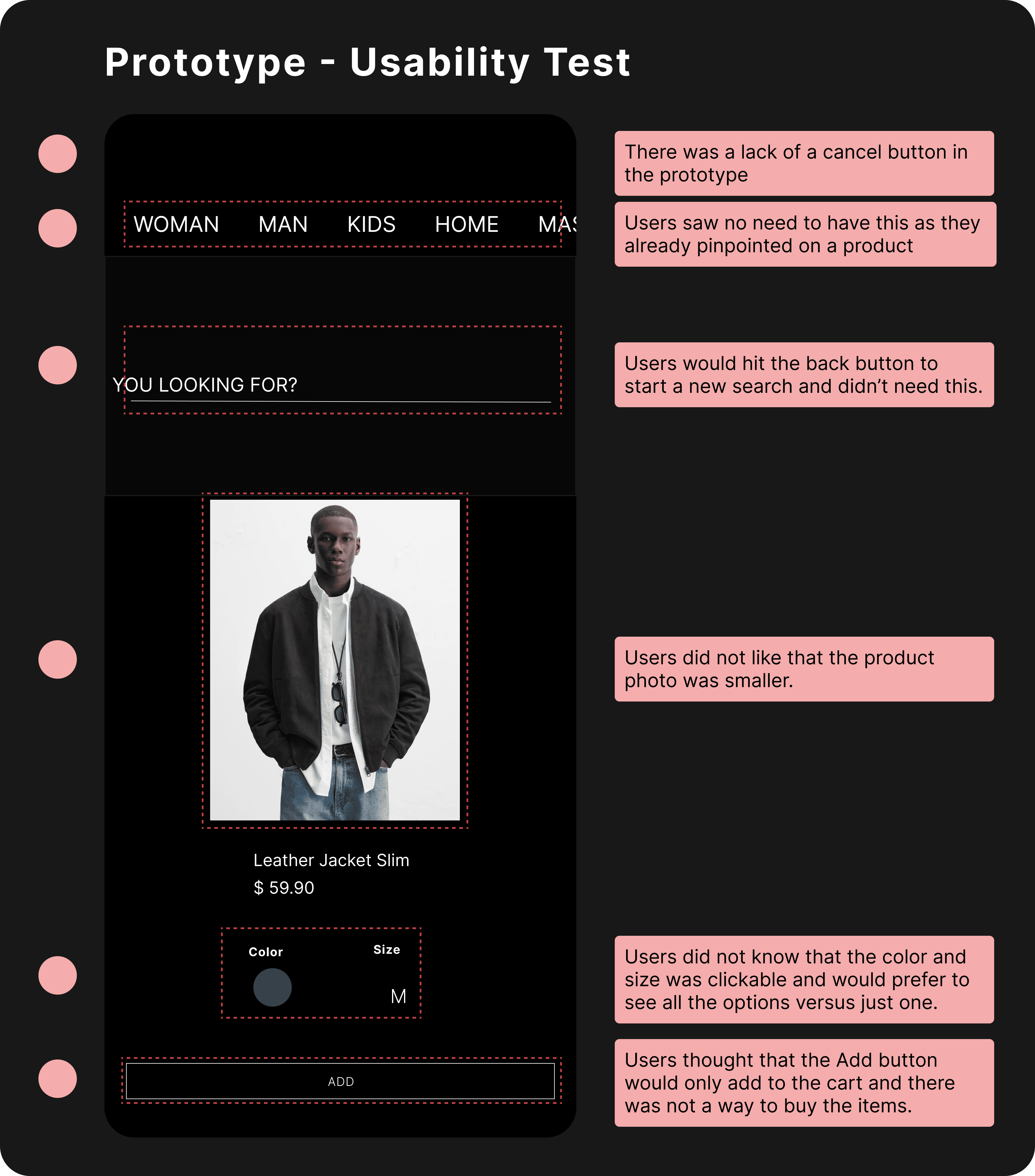
Usability Testing

New Opportunity
Eliminating Ambiguity in Purchase Interactions
Eliminating Ambiguity in Purchase Interactions
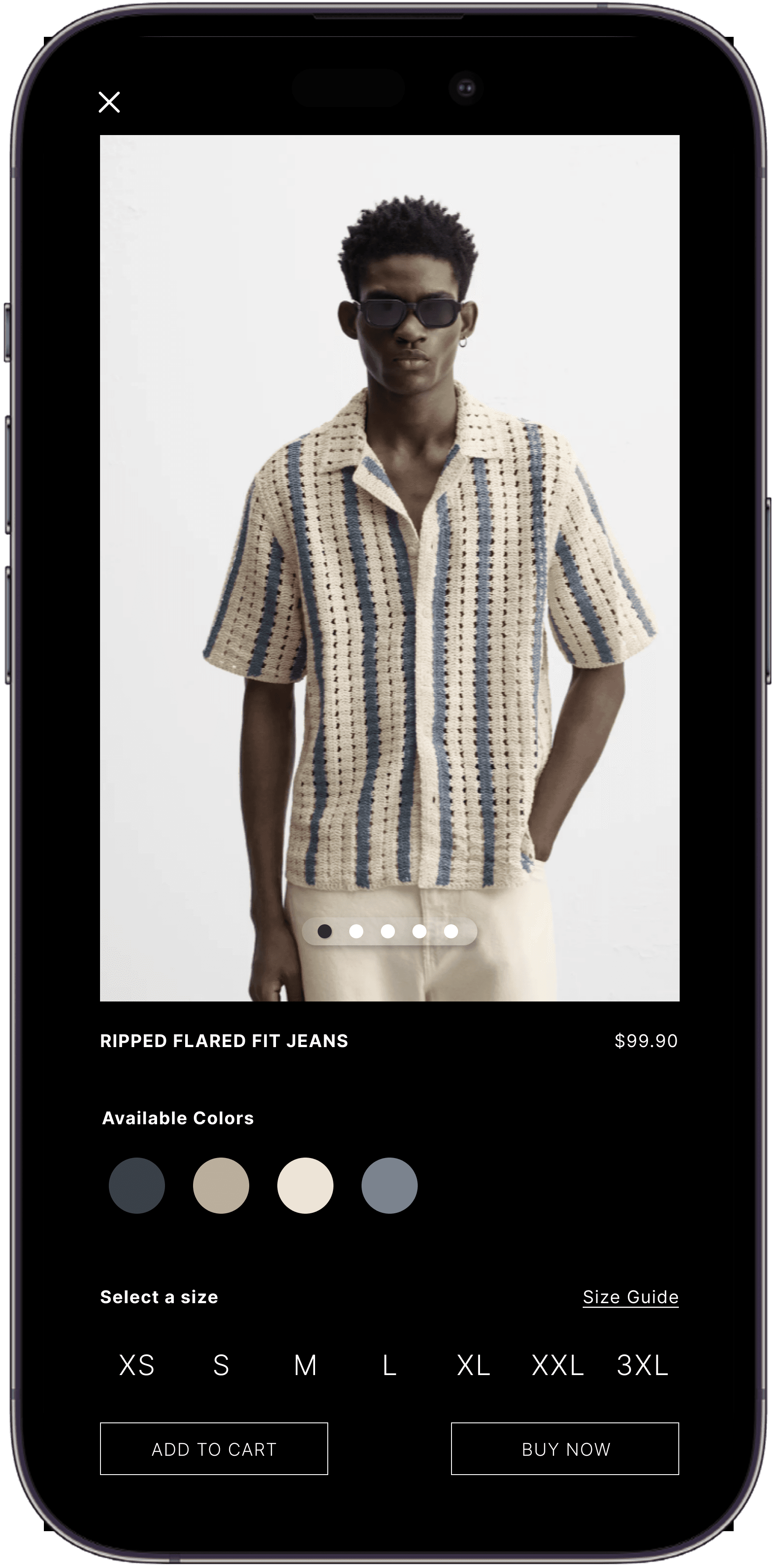
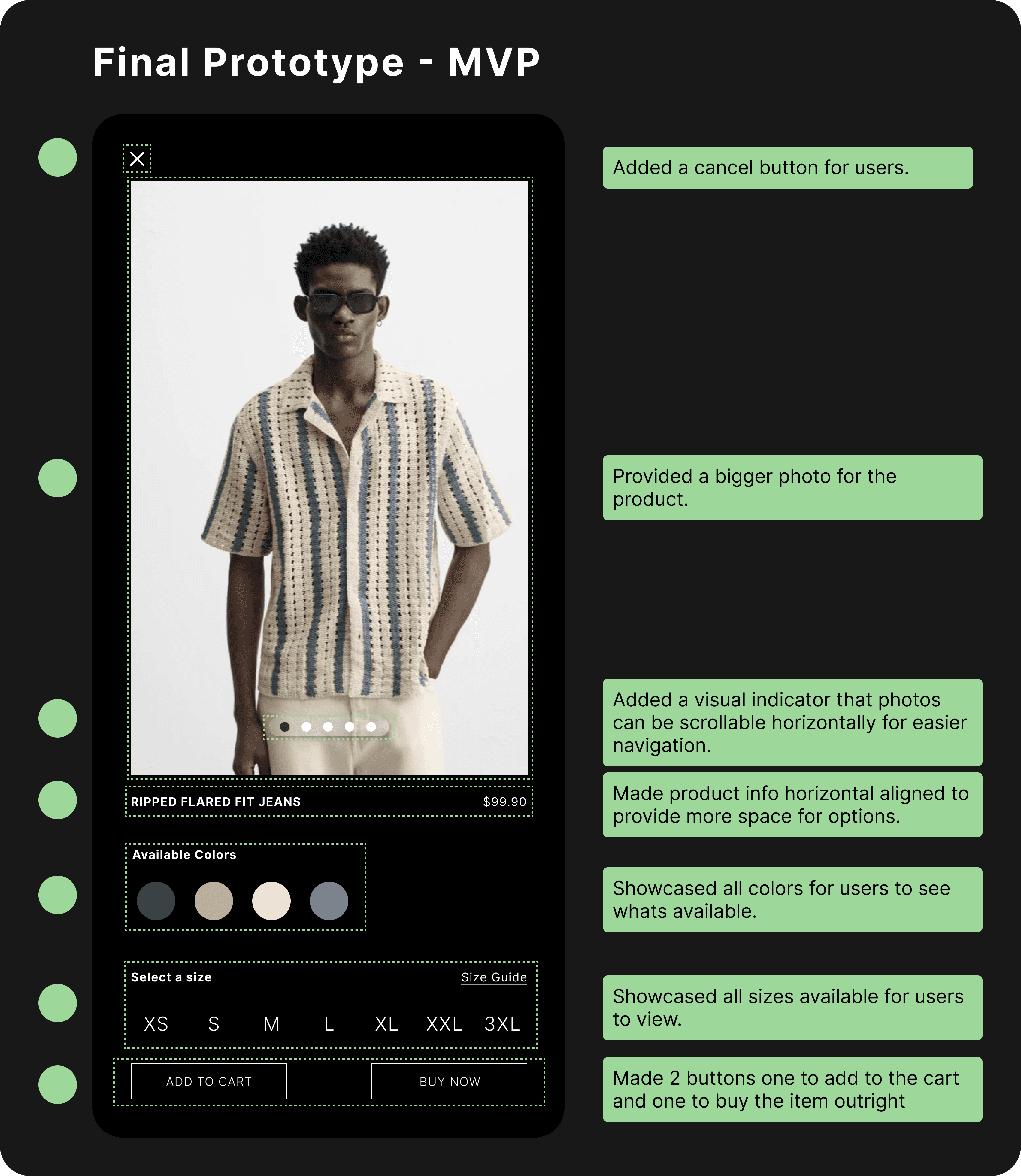
Usability testing showed that 8 out of 10 users confused the “Add” button with “Buy.” To reduce ambiguity, I added separate “Add to Cart” and “Buy Now” buttons.
Usability testing showed that 8 out of 10 users confused the “Add” button with “Buy.” To reduce ambiguity, I added separate “Add to Cart” and “Buy Now” buttons.
MVP
MVP
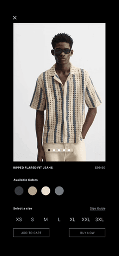
Solution 1
Horizontal Scrolling for product photos
Users can quickly scan through multiple photos horizontally.
Solution 1
Horizontal Scrolling for product photos
Users can quickly scan through multiple photos horizontally.
Solution 2
Providing product options to users
The options are provided right there to easily find and locate their product preferences.
Solution 2
Providing product options to users
The options are provided right there to easily find and locate their product preferences.
Solution 3
Customer Product Reviews
This adds social proof from past customers that liked the product creating more confidence to purchase.
Solution 3
Customer Product Reviews
This adds social proof from past customers that liked the product creating more confidence to purchase.
Challenges
Finding metrics to validate my solution
During the project’s usability testing, it initially took me some time to figure out which numbers would best validate the design solution. I revisited the problems I had chosen to focus on, and after some reflection, I researched the specific research techniques that aligned with the metrics I needed
During the project’s usability testing, it initially took me some time to figure out which numbers would best validate the design solution. I revisited the problems I had chosen to focus on, and after some reflection, I researched the specific research techniques that aligned with the metrics I needed
Are users able to navigate and complete tasks without supervision?
Are users able to navigate and complete tasks without supervision?
Task Success Rate
Task Success Rate
Do users go back if they are unsure of where to go next?
Do users go back if they are unsure of where to go next?
Backtracking Rate
Backtracking Rate
Do product reviews sway users to purchase viewed products?
Do product reviews sway users to purchase viewed products?
Click Through Rate
Click Through Rate
Impact
I measured my solution with users to get some metrics to validate my design solution. Below are the metrics I tested with users.
I measured my solution with users to get some metrics to validate my design solution. Below are the metrics I tested with users.
Click Through Rate

25%
Adding product reviews encouraged users to click on the Buy button by 25%
Click Through Rate
25%
Adding product reviews encouraged users to click on the Buy button by 25%
Task Success Rate

30%
Improved navigation increased completion task by 30%
Task Success Rate
30%
Improved navigation increased completion task by 30%
Back
Tracking Rate

22%
Reduced Backtracking rate by 22%
Back
Tracking Rate
22%
Reduced Backtracking rate by 22%
By the numbers
Metrics supporting my solution
Click Through Rate
Observations showed users clicked on the buy button more when viewing product reviews when users navigated their products
Current app
10 out of 24 users
41%
My Solution
16 out of 24 users
66%
66-41=
25%
Task Success Rate
Users were able to navigate and complete simple tasks successfully without assistance.
Current app
10 out of 24 users
41%
My solution
17 out of 24 users
71%
71-41=
30%
Back Tracking Rate
With an improved user flow, users did not back track much with the new design solution as compared to the current solution.
Current app
20 out of 24 users
83%
My solution
10 out of 24 users
41%
83-41=
22%
Reflection
What did I learn?
What did I learn?
Users can definitely pivot you into a new perspective that as a designer is refreshing in terms of learning new interactions and different ways of thinking. Although users feedback varies there is valuable information for the most part.
Users can definitely pivot you into a new perspective that as a designer is refreshing in terms of learning new interactions and different ways of thinking. Although users feedback varies there is valuable information for the most part.
Future plans
Future plans
I would want to incorporate and improve Zara's use of AI with the mobile app to provide users with clothing options or style tips when purchasing clothes, or the ability to make suggestions and provide clothe choices based on their preferences.
I would want to incorporate and improve Zara's use of AI with the mobile app to provide users with clothing options or style tips when purchasing clothes, or the ability to make suggestions and provide clothe choices based on their preferences.