ZARA
Mobile Design, UX Research & Prototyping
Summary
I translated user research into a mobile solution that improved the product view page by making colors, sizes, and reviews easier to find, driving confident purchases and higher conversion.
Role
UX Designer
Tools
Figma
Duration
May - July 2025
Type
Project
Impact
I turned uncertainty into increased user confidence to buy products.
Click Through Rate
25%
Adding product reviews encouraged users to click on the Buy button by 25%
Task Success Rate
30%
Improved navigation increased completion task by 30%
Backtracking Rate
22%
Removed redundant paths which reduced Backtracking rate by 22%
I love Zara’s aesthetic and style, but purchasing their clothing online often feels frustrating and difficult. I wondered why it felt that way and if others felt the same
Initial Observations
Currently the Zara app is designed as a fashion magazine rather than a shopping tool for users.
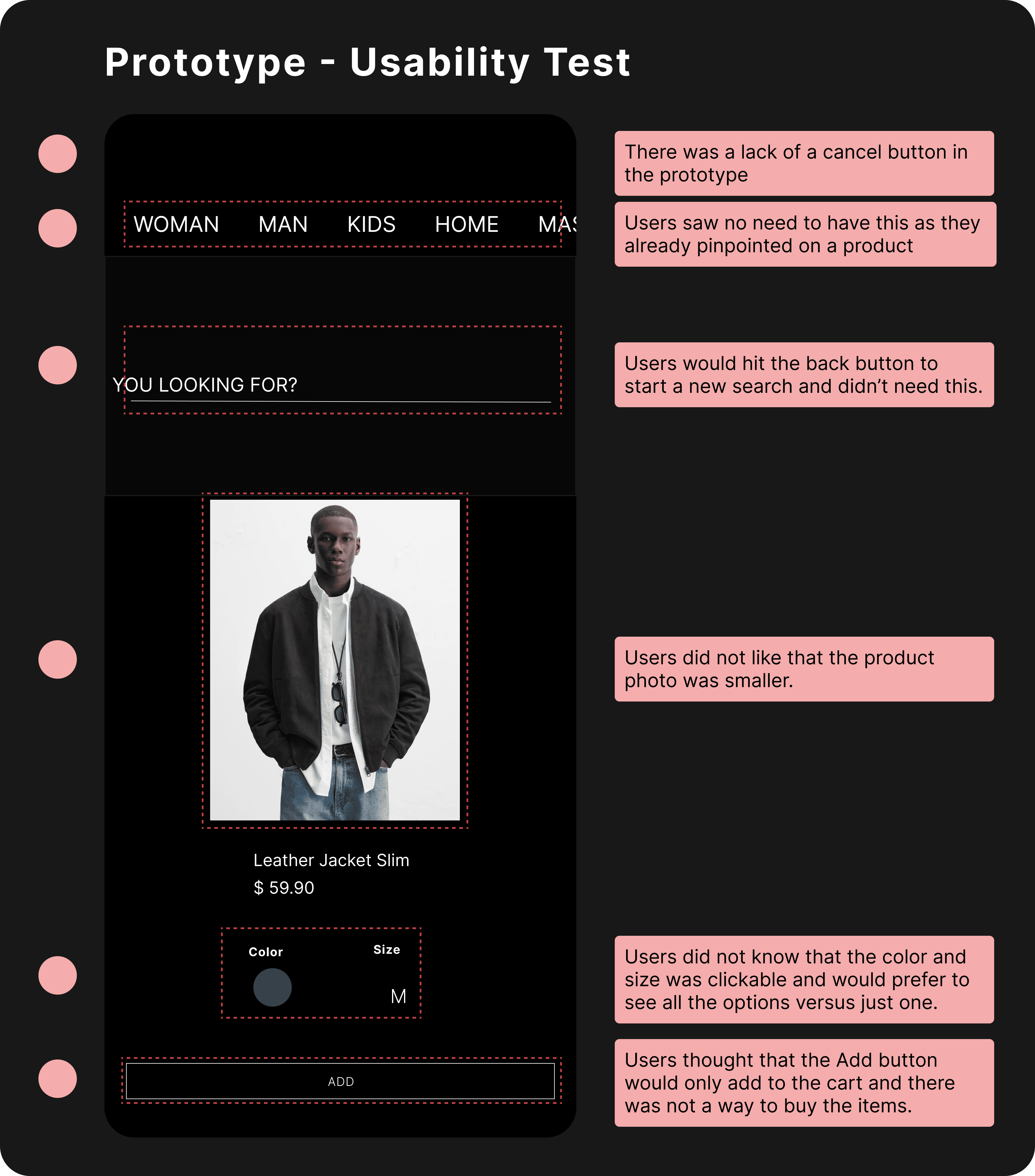
Its departure from standard design conventions is both a strength and a liability. What sets the experience apart also works against it. By breaking so heavily from established norms, the app frequently leaves users confused, disoriented, and frustrated.
80%
8 out of 10 users lost context as swipe gestures switched products instead of cycling images.
Swiping left or right changes product
20%
2 out of 10 users were able to find colors and sizes in the app.
Hidden Size Options
60%
6 out of 10 users experienced endless scrolling fatigue, causing them to stop browsing.
Endless vertical scrolling
Research
I evaluated the existing experience to understand user pain points
I observed 10 users interacting with the app to uncover navigation patterns and user expectations.

Conversion Friction
Users struggle to make confident purchasing decisions. They were indecisive if they should make a purchase or not.

Lack of Navigation Anchors
Users feel lost while browsing because the app lacks clear anchors to their original item.

Conversion Friction
Critical product information, such as size and color, is difficult to locate.
Design Decisions
How another clothing app inspired product card with familiarity and usability.
I looked at over 10+ clothing apps and the product card was easy to navigate. The two things that stood out with all the apps were how consistent product photos where shown and how easily accessible it was to view different sizes and colors they had.

Vertical Photo Scrolling to Horizontal Photo Scrolling

Size and color options shown early on in the product card
Usability Testing
I created prototypes to test design solutions and get feedback from users. Based upon the information received I made iterations and tested with users again to get more feedback.
Discovery
Users were looking for product reviews!
User testing showed demand for product reviews, prompting further research. According to a 2026 Capital One Shopping article customer reviews play a key role in influencing purchase decisions for both new and returning users.
99%
of American consumers read online reviews before making online purchases
92%
of consumers are hesitant to consider an online product without online reviews
96%
of consumers read online reviews before buying something new online.
I examined customer review implementations across other similar apps to guide my design decisions.

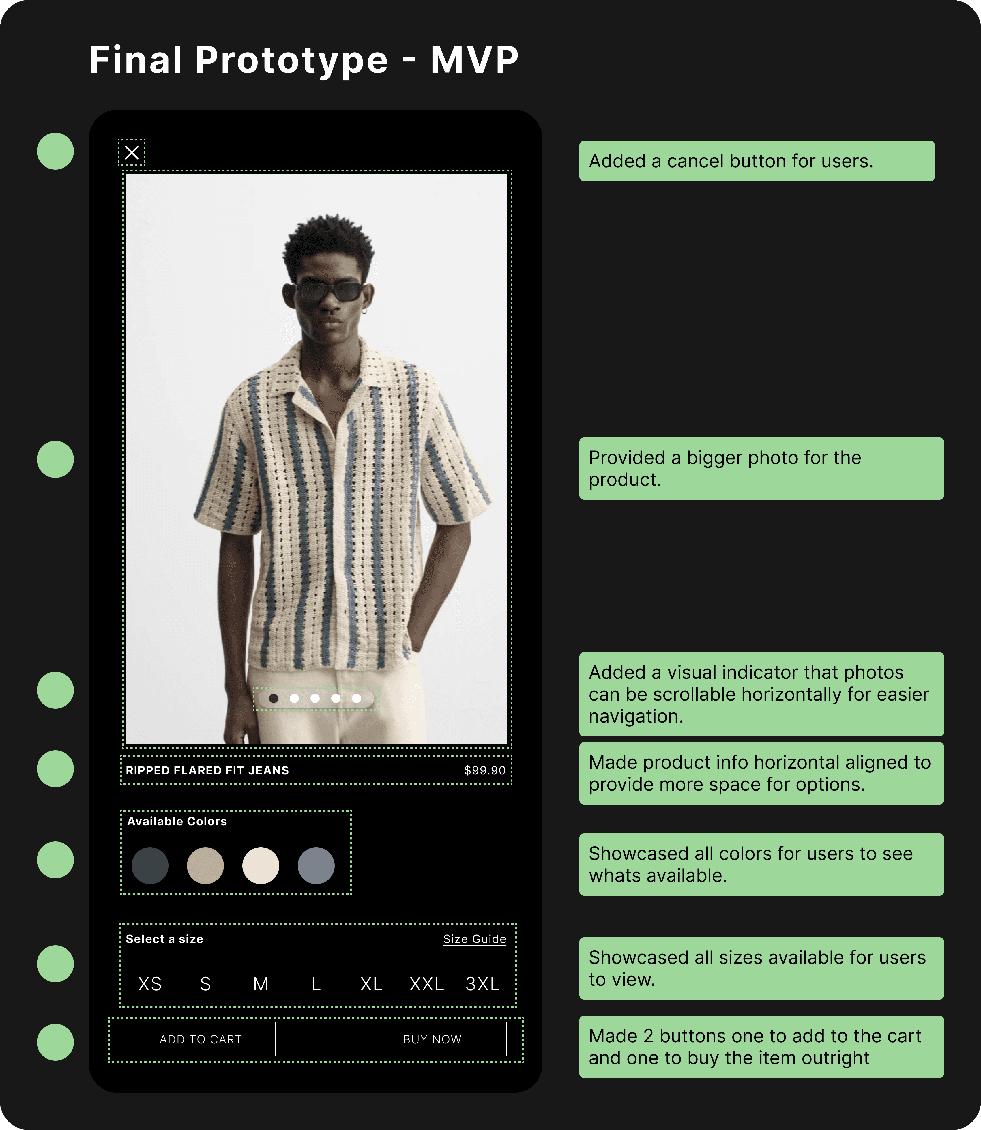
Final Deliverables
The research gathered with customers who used the app helped define three features that were incorporated into the final design.

Familiarity:
Users are more accustomed to swiping left and right expecting different photos of the product rather than changing the product entirely
Contextual discovery:
Users can browse similar products horizontally in a carousel while staying within the product card without losing track of their original item.
Increased Discoverability of Sizes & Colors
Users are able to see available colors and sizes initially when viewing the product without having to scroll down endlessly.

Social Proof
Users are more confident in purchasing when viewing reviews left by other customers.
Reflection
New opportunities emerged halfway through the process.
Even with thorough research and ideation, new insights can emerge late in the process and meaningfully improve both the problem definition and the solution. When an opportunity surfaced after usability testing, I intentionally slowed down and revisited earlier insights to validate it aligned with the original user problem.
Shane's
Redesigning to modern standards
Coming Soon